

When designing a premium spirit, the color of the bottle is far more than a simple container choice—it is a fundamental component of brand identity and market positioning. Before a customer reads a label, tastes the product, or understands its provenance, the bottle’s hue acts as a silent communicator on the shelf. This guide examines the strategic role of Liquor Bottle Colors in branding and consumer appeal, exploring how specific shades can influence perception, convey brand values, and ultimately drive purchase decisions in a competitive marketplace.
Brand Personality & Color Strategy Alignment
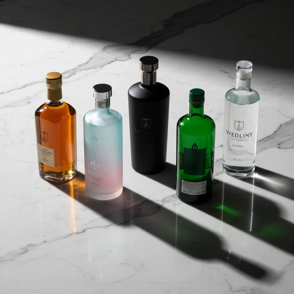
Your liquor bottle colors need to match who you are as a brand—not just look pretty on a mood board.
Think of color as your brand’s handshake. People read your personality through that glass before they taste anything. Get it wrong? You’re a luxury whiskey in a neon bottle. Get it right? Customers feel like they’ve found what they were looking for.
The Four Core Brand Personalities (and Their Color Codes)
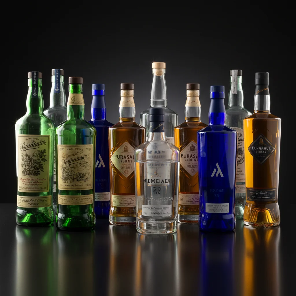
Luxury brands lean hard into deep amber and black glass. Rémy Martin’s dark cognac bottles signal “special occasion” from across the room. The heavy amber creates that warm glow. Picture candlelight through expensive curtains. Black bottles push this even further. Johnnie Walker’s Blue Label uses opaque black to say “this costs $200 and you know it.” The psychology here? Darkness means mystery. Mystery means value. These colors attract buyers aged 35-60 with money to spend. They collect spirits instead of just drinking them.
Adventure-seeking brands break every traditional rule. Aviation Gin uses transparent bottles and bold navy labels. Clean, modern, unexpected. Monkey 47 gin has that eye-catching brown apothecary bottle. It looks like something from an explorer’s kit. These liquor bottle colors speak to 25-45 year-olds who read ingredient lists. They try new cocktails. They share their bar cart on Instagram. They want a story, not a status symbol.
Eco-conscious distillers are painting the shelf green. Hendrick’s cucumber-infused gin built their whole identity around that dark green bottle. It signals botanical ingredients before you read a single word. Fair Quinoa Vodka uses recycled green glass with visible texture. Their audience responds to earth tones. We’re talking 28-50 year-olds, urban, willing to pay 20% more for sustainable products. Green and brown glass say “we care about more than profit.”
Youth-focused brands throw out the playbook. Pink Whitney vodka exploded with millennial and Gen Z drinkers because that bright pink bottle photographs like crazy. White Claw hard seltzers use slim, colorful cans that feel more like LaCroix than liquor. These brands get it. Their 21-35 audience sees drinking as social currency. The bottle needs to look good in a hand holding a phone.
The smartest move? Pick one personality. Own it. Trying to be luxury and adventurous dilutes both messages. Your color choice is a promise—make sure you keep it.
Category-Specific Color Conventions vs Disruption Opportunities
Every spirit category has its unofficial dress code. These liquor bottle colors started as science, then became tradition, and now? They’re ripe for revolution.
Whiskey’s Amber Armor (and Why It Matters)
Whiskey lives in amber bottles for a reason that goes beyond looks. UV light is aged whiskey’s worst enemy. Golden-brown rays break down the delicate compounds that took years to develop in oak barrels. Sunlight can turn a smooth 12-year Scotch bitter and flat. This happens within weeks.
Amber glass blocks up to 98% of UV rays. It’s functional protection in a warm, inviting color. Walk through any whiskey section. Maker’s Mark, Woodford Reserve, Glenfiddich—they all wear shades of caramel and honey. The color has become visual shorthand. Our brains now read “amber bottle” as “aged spirit inside.”
But here’s where it gets interesting. Proper No. Twelve Irish Whiskey uses clear glass with amber liquid visible. The whiskey itself provides the color story. Westland Distillery tried dark green bottles for their single malt. Sales dipped. Customers thought it was Irish whiskey, not American. The color confusion cost them shelf presence.
Vodka’s Crystal Clear Identity Crisis
Premium vodka brands made transparency their religion. Grey Goose, Belvedere, Tito’s—all crystal clear. The message? “We have nothing to hide. Our vodka is so pure it doesn’t need protection.”
That’s marketing, not chemistry. Clear bottles expose vodka to light damage just like whiskey. The difference? Most vodkas don’t have complex flavor compounds to lose. They’re designed to be neutral. Light damage shows up slower.
Still, some vodka makers are breaking ranks. Reyka uses frosted glass that diffuses light. It keeps that clean look. Konik’s Tail Polish vodka comes in brown glass. This emphasizes their old-school production methods. These disruptions work best with full brand story support.
Tequila and Gin: Where Rules Get Fuzzy
Tequila used to come in clear glass to show off that golden or crystal liquid. Patrón built an empire on distinctive clear bottles. Don Julio followed. But now? Clase Azul uses hand-painted ceramic bottles in deep blues and whites. They’re selling Mexican artisan culture, not just tequila. That shift in liquor bottle colors made them luxury collectibles.
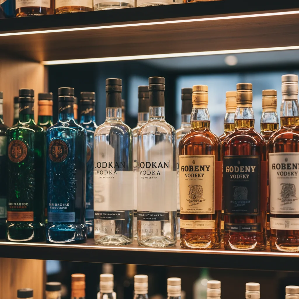
Gin might be the most color-adventurous category. Tanqueray’s green bottle became iconic in the 1950s. Bombay Sapphire made translucent blue famous. Hendrick’s went dark Victorian green. The Botanist uses tall brown apothecary glass. There’s no dominant rule. So there’s no rule to break.
That freedom comes with risk. Your gin needs stronger visual branding elsewhere—shape, label design, cap style. The bottle can’t do all the heavy lifting.
Breaking Convention the Right Way
Disruption for disruption’s sake flops. You need strategic rebellion. X-Rated Fusion Liqueur uses hot pink bottles and targets nightclub crowds. This works because everything aligns—flavor, marketing, placement. The bold choice fits the entire product.
The pattern? Successful color disruption needs total brand commitment. Half-measures confuse buyers and kill sales.
Label Design Integration: Contrast, Finishes & Material Selection
Your bottle color means nothing if your label disappears against it.
Liquor bottle colors and label design form a partnership. One without the other is like serving caviar on a paper plate. Glass and label work together to help shoppers read your brand name from three feet away—or they walk right past.
The Contrast Equation: Making Critical Elements Pop
Contrast isn’t about being loud. It’s about being easy to read under bad lighting. Most liquor stores have fluorescent overhead lights mixed with warm shelf lighting. Your label needs to work in both.
Dark bottles demand light labels. Black glass bottles paired with white or metallic labels create instant shelf presence. The Glenlivet uses cream-colored labels on dark green bottles. Your eye catches the pale rectangle right away. Contrast ratio matters here. Aim for at least 4.5:1 between bottle and background label color. Anything less? Your brand name becomes a guessing game.
Clear bottles need visual anchors. Transparent glass shows everything. The liquid, the back label, the shelf behind it. Your front label becomes the one solid element. Absolut Vodka nailed this with their thick, opaque label on crystal-clear glass. The label provides weight and structure. It grounds the design.
Amber bottles create warm challenges. That golden-brown glass looks beautiful but kills contrast. White labels can appear dingy. Black labels disappear. The sweet spot? Deep burgundy, navy blue, or forest green labels. Bulleit Bourbon uses their signature green label on amber glass. The colors are related but different enough to create separation.
Three elements must stand out: your brand name, spirit category, and alcohol percentage. Everything else is negotiable. Shoppers need to identify what you’re selling in two seconds. Otherwise, your beautiful design failed its primary job.
Paper Stock: The Texture Behind the Color
Coated paper gives you vibrant, saturated colors. The clay coating creates a smooth surface that holds ink without absorption. Your reds stay fire-engine bright. Your blacks look deep black, not charcoal gray. Premium vodka brands love coated stock for this punch of intensity. The finish photographs well for social media.
But coated paper can look cheap if overused. That slick, shiny surface screams “mass production.” Every element gleams. The label feels disconnected from craft spirits.
Uncoated paper tells a different story. The rough texture absorbs ink in an uneven way. Colors appear softer, earthier, more subdued. This “imperfect” look signals handmade quality. Craft distilleries use uncoated stock to show small-batch production. The label feels like premium stationery, not a sticker.
The color shift is real. A bright orange on coated paper becomes burnt orange on uncoated stock. Blues turn dustier. Test both substrates during design. What works on your computer screen will look different on actual paper.
Finishes That Transform Ordinary Into Unforgettable
Spot UV varnish creates dimension without adding cost. Put glossy clear coating over specific design elements on a matte label. Your logo looks raised and wet. The Botanist Gin uses this technique. Their illustrated botanicals get spot gloss treatment. The background stays flat. Your fingers want to touch it.
Matte varnish does the opposite magic. It removes all shine and creates a velvety, sophisticated surface. Matte finishes absorb light instead of reflecting it. This makes liquor bottle colors appear richer and more complex. High West Whiskey uses matte labels that feel like suede. The finish shows luxury through touch, not flash.
Foil stamping remains the king of premium finishes. Gold foil catches light and screams “special occasion.” But here’s the trick—less is more. A small foil accent on a simple label outperforms a fully-foiled design. Hendrick’s uses minimal gold foil on their apothecary-style label. It adds just enough elegance without looking like a Vegas casino.
Embossing creates physical dimension. The label has actual peaks and valleys you can feel. This works well on heavy uncoated stock. Pair it with dark bottle glass. You’ve built a tactile brand experience. Don Julio 1942 Tequila uses deep embossing on their labels. You recognize the bottle by touch before you see the logo.
The material truth? Your finish choice should match your price point. Foil and embossing on a $15 bottle feels dishonest. Simple matte varnish on a $75 whiskey feels cheap. The finish, the paper, the bottle color—they all need to work together.
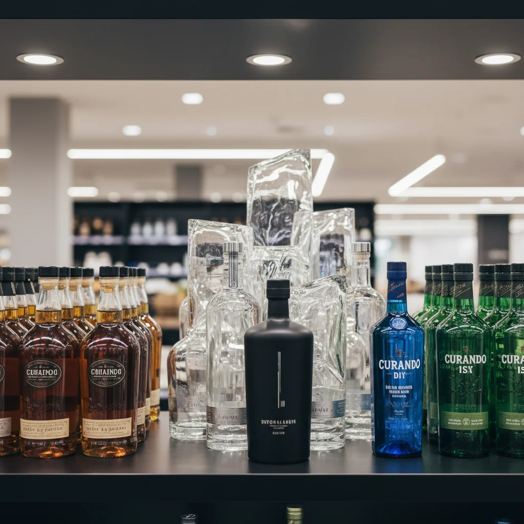
Bottle Material & Color Options for Brand Identity
Glass comes in more varieties than most distillers realize. Transparent or colored glass? This choice affects shelf life, production costs, and brand positioning.
Clear Glass: The Display Case Strategy
Transparent bottles put your liquid front and center. Customers see the exact color of your spirit. That pale straw gin. The deep amber of barrel-aged rum. Crystal vodka that catches light like a prism.
This visibility builds trust. Nothing’s hidden. High West Double Rye shows off its rich caramel color through clear glass. Customers see that visual richness. They expect matching flavor before opening the bottle.
But clear glass offers zero UV protection. Sunlight breaks down delicate flavor compounds within weeks. You’re betting that your product moves fast off shelves. Premium vodkas can take this risk—they have minimal flavor compounds to lose. Aged whiskeys? Not so much.
Production costs run lower with clear glass. Manufacturers produce it in higher volumes. You’ll pay $0.80-$1.20 per bottle versus $1.50-$2.50 for specialty colors. For startups watching every dollar, that difference adds up.
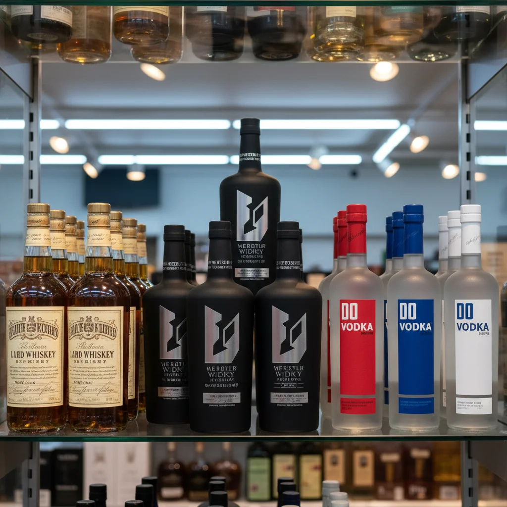
Colored Glass: Built-In Product Protection
Amber glass blocks 90-98% of harmful UV rays. It’s the gold standard for barrel-aged spirits. Those complex esters and phenols that took years to develop stay stable longer. Liquor bottle colors in the amber family—from honey gold to deep brown—extend shelf life by months.
Green glass offers moderate UV protection. It blocks 60-80% of damaging light. It’s the middle ground. Tanqueray built their entire visual identity around that distinctive green. The color protects their botanical gin. Plus, it creates instant brand recognition.
Cobalt blue glass provides similar protection to green. But it signals different brand values. Blue feels modern, clean, premium. Bombay Sapphire made translucent blue iconic in the gin category. The color became synonymous with their brand.
Specialty colors—black, frosted, custom tints—require minimum order quantities of 10,000+ units. Production costs jump 40-60% above clear glass. But exclusivity has value. A custom bottle color can trademark your brand through appearance alone. Clase Azul’s hand-painted ceramic bottles command $150+. Nobody else looks like them.
Screen Printing: Color That Doesn’t Fade
Direct screen printing applies enamel onto glass. The color fuses in place during firing. It won’t peel, scratch, or fade like paper labels. Jack Daniel’s prints their logo straight on amber glass—you could scrape it with a key and it stays put.
Screen printing handles up to six colors in one design. You can create patterns, gradients, and detailed illustrations. The Balvenie uses multi-color screen printing. Their craft story appears right on the bottle.
Cost structure favors volume. Setup fees run $800-$2,000 per color. But per-bottle costs drop to $0.30-$0.60 for large runs. Small batches pay premium prices. The breakeven point hits around 5,000 bottles.
The limitation? Screen printing works best with bold, simple designs. Fine text under 8-point gets fuzzy. Photos don’t translate well. Need intricate illustration or tiny fonts for your brand? Labels give you more options despite being less durable.
Conclusion
The color of a liquor bottle is far more than a simple design choice—it is a powerful tool for storytelling, brand differentiation, and shelf impact. From the classic elegance of amber to the modern allure of cobalt blue, each hue communicates a unique message and connects with consumers on an emotional level. By carefully selecting the right bottle color, brands can enhance their identity, stand out in a competitive market, and create a lasting impression.
At TP Glass Bottle Manufacturer, we understand the critical role that color plays in your branding success. As a professional glass bottle producer, we combine expert craftsmanship with innovative customization to help you bring your vision to life. Whether you’re aiming for timeless sophistication or bold contemporary appeal, we provide high-quality, durable glass bottles in a wide spectrum of colors and finishes—tailored to elevate your brand and captivate your audience. Let’s collaborate to create bottles that don’t just hold your spirit, but also tell its story.
Ready to make your brand shine? Contact TP Glass Bottle Manufacturer today for bespoke glass packaging solutions that blend artistry with strategy.