
A vodka bottle doesn’t just hold liquid — it holds a story. Look at the sloped shoulders. Notice the etched Cyrillic lettering. Feel the weight of thick glass in your hand. Every detail of a classic Russian vodka bottle is a deliberate act of cultural expression. This article explores the iconic design elements of Russian Vodka Bottles and how high-quality glass packaging enhances their appeal, functionality, and brand value.
Table of Contents
The Cultural DNA Behind Russian Vodka Bottle Design
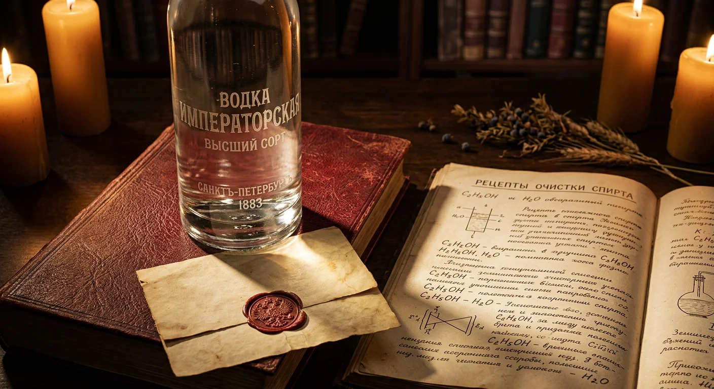
In 1894, the Russian government published a document that changed the visual identity of an entire industry. It wasn’t a design brief. It was a chemistry report — Dmitri Mendeleev’s doctoral thesis. It established that the ideal concentration of ethanol in water is 40% ABV. That standard became law. And it changed what a vodka bottle needed to be.
Here’s the logic: your product’s defining virtue is purity — not color, not aroma, not age. So the packaging has to prove it. You can’t hide purity. You have to display it. That’s why ultra-clear glass became the default material for Russian vodka bottles. Not as a trend. As a declaration. The bottle isn’t dressed up. It’s transparent on purpose. It says: look inside. There’s nothing to conceal.
That single decision — glass as proof, not decoration — built a visual language that lasted over a century.
The Cylinder as Cultural Symbol
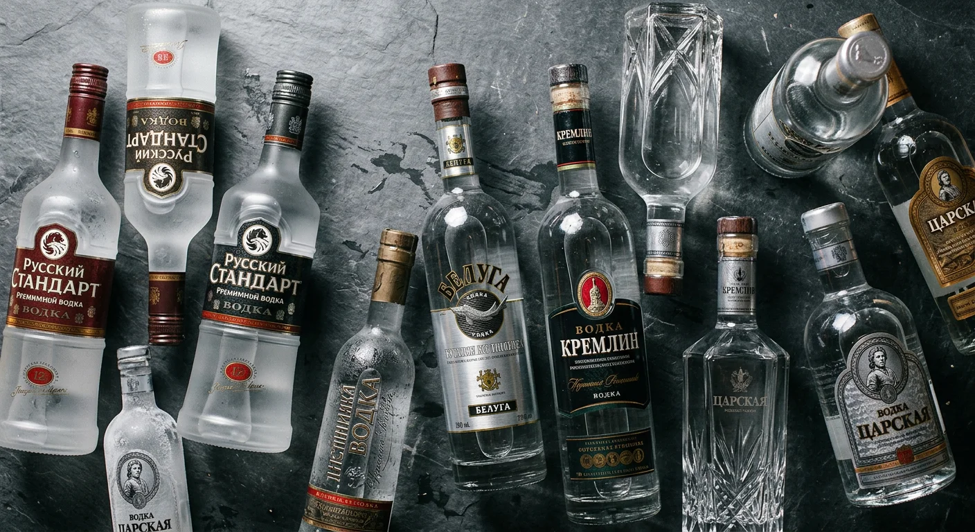
Other spirits went vertical and expressive. Cognac bottles curved. Whisky Bottles tapered. Russian vodka went cylindrical, and stayed there.
The cylindrical vodka bottle shape isn’t accidental geometry. It reflects something deeper about vodka’s place in Russian society — a practical, democratic spirit. Not a luxury reserved for drawing rooms. Something shared. Something honest. The cylinder is the shape of function. It stacks. It pours clean. It doesn’t perform.
During the Soviet era, that practicality became official policy. State distilleries standardized their glassware. Consistency was the point — not differentiation. That standardization produced something unexpected and powerful: a shape so repeated, so rooted in cultural memory, that it became an icon by default.
Transparency as National Identity
This is what separates Russian vodka bottle design from almost every other spirits category.
Most premium liquor packaging works by obscuring — dark glass, heavy label coverage, elaborate wax seals. Russian vodka does the opposite. The clear glass spirits bottle is honesty made visible. Cyrillic lettering pressed into the glass. Minimal color. Full transparency.
What you see is the liquid itself — colorless, still, certain.
That restraint is a design philosophy. For brands entering the premium vodka space today, it remains one of the strongest visual signals available: confidence in the product, expressed by refusing to hide it.
Iconic Russian Vodka Bottle Designs That Defined an Era
Three bottles. Three different eras. Three very different answers to the same design question: what does Russian vodka look like?
Each one tells you something real — about production systems, about cultural values, about the strange way that utility can become beauty over time.
Stolichnaya: The Geometry of Purity
The Stolichnaya bottle is almost brutally simple. Tall. Narrow. Cylindrical. The proportions are no accident. That elongated silhouette pulls your eye upward, making the bottle feel leaner and more refined than its actual volume. It’s a visual trick that works because the design is also physically honest. No excessive curvature. No dramatic flaring at the base. Just a clean column of ultra-clear glass doing what it was always built to do: let the liquid speak.
The transparency was the message. Colorless glass around colorless liquid. A proof-of-purity argument made without a single word.
Then there’s the red star on the label. Soviet iconography — no question about it. But here’s what’s worth noting: as Stolichnaya passed through rebranding cycles and ownership disputes over the decades, that red star stayed. Not out of nostalgia. Designers kept it because the symbol had become the brand itself. The working-class aesthetic had aged into something else: heritage. In today’s premium vodka market, that kind of visual continuity is nearly impossible to build from scratch. Stolichnaya never had to.
Moskovskaya: Design by Constraint
Moskovskaya is a different kind of icon — one shaped by the Soviet production system, not despite it.
Mass manufacturing set strict rules. The bottle had to be durable, stackable, and cheap to produce. Decoration was a problem, not a feature. Labels stayed functional — minimal text, minimal graphics. Nothing that couldn’t survive a warehouse.
The biggest design driver was the 12-kopeck deposit system. Soviet-era bottles carried a refundable deposit. Consumers returned them. Factories cleaned and refilled them. That one policy shaped every decision: the glass had to be thick enough to handle repeated use and industrial washing. The result was a solid, unpretentious form — not beautiful in a traditional sense, but physically sound. Honest about its purpose.
That utilitarian integrity is its own kind of vodka bottle aesthetic. Think of it as the design equivalent of a well-worn work coat. Nothing performed, everything earned.
Elizabeth Bem’s Art Bottle (c. 1900): The Outlier
And then there’s the one that breaks every rule.
Around 1900, illustrator Elizabeth Bem created an art-glass vodka vessel from a completely separate visual tradition. Green-tinted glass, made by hand. Running along its surface: a serpentine embossed figure — the zelyony zmei, the “green serpent.” This figure comes from deep in Russian folklore as the physical form of alcoholic temptation.
The craft itself was remarkable. The colored glass required precise chemical formulation. The serpent relief demanded skilled mold work. As an exhibition piece, it functioned more like sculpture than packaging.
But its importance goes beyond the craft. The Bem bottle stands as the earliest documented case of premium vodka bottle design as a deliberate artistic statement — a full century before “luxury liquor bottle design” became a real industry category.
It was ahead of its time. Most design movements can’t say that.
Russian-Inspired Design Elements You Can Apply to Your Own Vodka Brand
Russian vodka design is a system. Not a mood board, not a vibe — a system. Systems can be learned, borrowed, and rebuilt.
The visual language from Russian distilleries breaks into three clear categories: form, pattern, and color. Each one stands on its own. Each one carries meaning. Any brand can use all three — as long as you use them with intent.
The Three-Part Design Matrix
Form — the shape of the bottle itself
Russian vodka bottles come in three main profiles:
- Cylindrical — the default shape. Honest, stackable, born from Soviet-era standardization. This shape carries cultural weight because it was never built to impress. That’s the point.
- Prismatic/faceted — multi-sided geometry that catches light without needing colored glass. The facets do the decorative work. The liquid doesn’t have to.
- Tapered/slim — a long, narrow shape that gets thinner toward the neck. It pulls the eye upward. In a bar-back lineup, this is the shape that reads as premium.
Your form is your positioning. Cylindrical says heritage. Prismatic says craft. Tapered says luxury.
Pattern — the surface language
Four motifs have shaped Russian spirits packaging across different eras:
- Wheat sheaves — agricultural, honest, tied to grain origins
- Double-headed eagle — imperial authority, pre-Soviet heritage, a strong market signal in Western Europe
- Star forms — Soviet-era icons that have picked up retro legitimacy over time
- Serpentine relief — drawn from the zelyony zmei tradition, rare and hard to miss
These aren’t decorations. They’re shortcuts. A double-headed eagle on an embossed glass vodka bottle communicates tsarist-era prestige in about half a second. That’s what smart pattern selection does — it moves cultural meaning faster than any label copy can.
Color — the transparency spectrum
- Ultra-clear glass — purity as promise, the core Russian tradition
- Smoked green — the art-glass lineage, Elizabeth Bem’s century-old contribution still showing up in craft spirits today
- Cobalt blue — high contrast, cuts through in cold retail environments, strong in export markets
- Amber — warmth and aged-spirit associations, less traditional but works well for brands targeting whisky drinkers
A Note on Market Fit
Not every Russian design element hits the same in every market. This is worth knowing before you finalize anything.
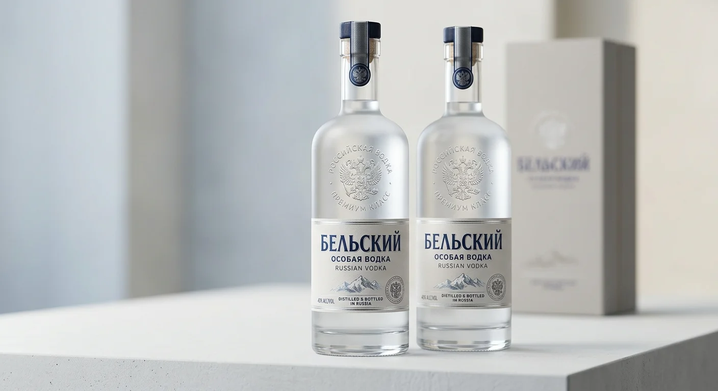
In North American and Western European markets, imperial imagery — the eagle, Cyrillic script, tsarist motifs — performs well. Buyers in these markets connect those symbols with authenticity and heritage. The frosted glass vodka bottle with minimal labeling also over-indexes here. It reads as confident and sophisticated.
In Asian export markets, cobalt blue and geometric prismatic shapes tend to beat the plain transparent cylinder. Visual complexity signals value in a different way. A bottle that looks clean and minimal in Stockholm can look underdressed in Shanghai.
So pick your primary market before you lock in your design brief. Russian-inspired elements are flexible, but they don’t travel the same across every region.
The goal isn’t to copy Stolichnaya or rebuild Soviet packaging. It’s to understand why those designs worked — and pull out the core logic behind them. Form, pattern, color. Three variables. Endless combinations. That’s where your bottle starts.
Why the Right Glass Bottle Manufacturer Defines Your Brand’s Market Position
The bottle you choose is a manufacturing decision. It’s also a brand decision — and those two things are harder to separate than most people expect.
A well-designed Russian-inspired vodka bottle touches at least five distinct craft processes. Mold engineering. Glass thickness calibration. Surface embossing. Frosted finishing. Closure tolerancing. Get one wrong, and the design brief you spent months refining becomes a production problem you spend months fixing.
That’s where manufacturer selection stops being a procurement task and becomes a strategic one.
What Separates a Capable Manufacturer from a Convenient One
Most buyers start supplier conversations asking the wrong question. They ask: can you make this? The better question is: have you made something like this before, at scale, for a market where it has to be right?
That distinction matters because Russian vodka bottle design is demanding in specific ways:
- Deep embossing on cylindrical surfaces needs precise mold work — the kind that produces clean relief lines, not soft, rounded approximations
- Frosted glass finishes require consistent acid-etching or sandblasting across full production runs, not just sample batches
- Ultra-clear glass formulation depends on controlled raw material sourcing — any iron contamination shifts color, and clear glass leaves no room for imperfection to hide
A supplier without hands-on experience in these areas will figure it out on your order. You pay for that — in time, in rejects, in delayed market entry.
The China Manufacturing Advantage — Without the Compromise
There’s a common assumption in the premium spirits industry that European glass equals better glass. It’s easy to see where that idea comes from. It’s also no longer accurate.
ISO-certified Chinese glass manufacturers — those specializing in luxury liquor bottle design and export-grade spirits packaging — now match European counterparts on quality standards. The economics are different too:
- Unit cost advantages of 25–40% on comparable custom runs
- Lead times from mold approval to first production: 35–50 days
- MOQ flexibility that European suppliers rarely match at custom tooling price points
TP Glass Bottle Manufacturer holds a dedicated library of Russian-style bottle profiles — cylindrical, prismatic, tapered — backed by existing mold assets. That cuts both cost and development time for brands working within familiar silhouette conventions. Need something original? Custom mold development is available, with full technical documentation and pre-production sample approval built into the process.
The capability is there. The certifications are in place. What turns a research conversation into an actual result is a clear design brief.
Submit your requirements and request a free sample proposal — it’s the fastest way to see what’s achievable within your timeline and budget.
Conclusion
The iconic design of Russian vodka bottles is far more than a visual detail—it is a powerful tool for brand differentiation, a reflection of Russian heritage, and a key factor in shaping consumer perception. Premium glass packaging is integral to this success: it not only safeguards the vodka’s purity and smooth taste, ensuring the spirit retains its quality over time, but also provides the perfect canvas to showcase the distinctive designs that have made Russian vodka recognizable worldwide.
From classic, timeless shapes to designs that honor cultural traditions, the synergy between iconic bottle design and high-quality glass packaging elevates a brand’s value and helps it stand out in a competitive global market. If you’re a vodka brand looking to craft iconic, premium packaging that embodies heritage and quality, TP Glass Bottle Manufacturer is here to support you with customizable, high-quality glass solutions tailored to your brand’s vision.